
For centuries, the Silk Road has been a network through which ideas, objects, languages and value moved between cultures.
That history became a conceptual starting point for Lotus&Oak. Ancient coins and mirrors, objects that once carried economic, symbolic and cultural meaning across civilizations, offered a way to explore exchange without relying on literal representations of East and West.
The identity translates that heritage into a contemporary system built around connection, continuity and trust.

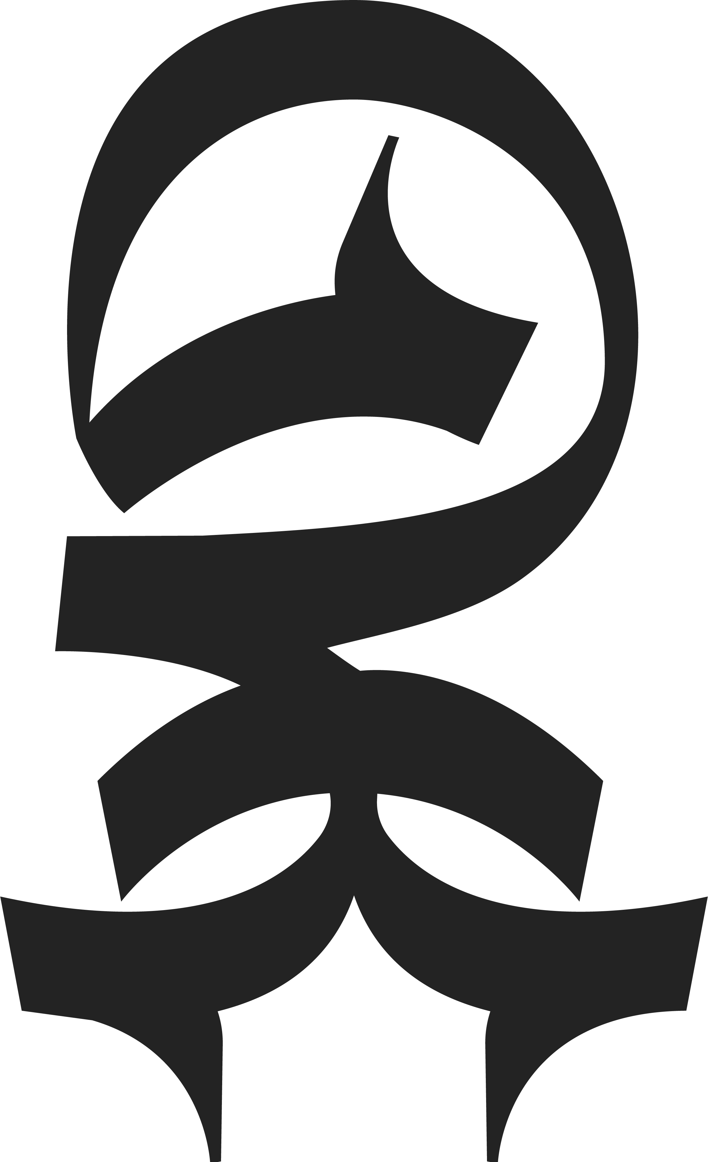
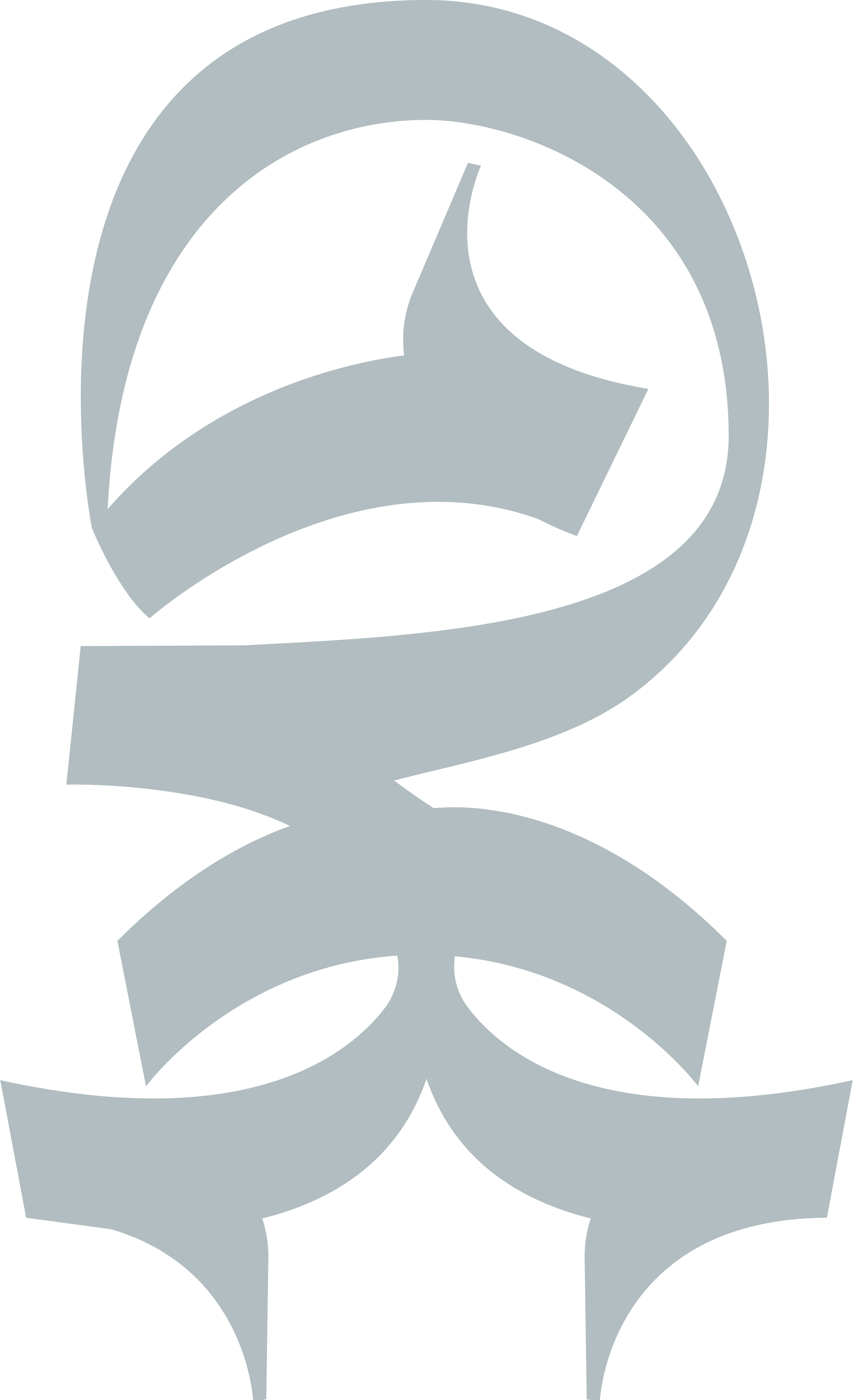
At the centre of the identity is a symbol designed to hold multiple key concepts at once.
Its circular silhouette references ancient Asian mirrors, while the repeated forms suggest people gathered around a table, a network created through exchange. The geometry also recalls the traditional Heaven-Earth Chinese coin, combining a circular exterior with a central opening. The same structure echoes the top view of an oak tree as well, connecting the symbol back to the name itself.
The mark creates a meeting point between heritage, network, exchange and longevity.


Lotus&Oak needed to communicate exclusivity without becoming ostentatious. The visual language therefore relies on restraint rather than decoration.
A palette of Obsidian, Ancient Bronze, Stone Grey and Linen introduces warmth and materiality through subtle tonal shifts. Instrument Serif gives the identity its distinctive editorial presence, while Instrument Sans brings clarity to longer and more functional information.
Large typography, controlled contrast and generous negative space create a system that feels cultivated, discreet and contemporary, confident enough not to compete for attention.


The central symbol expands into a broader graphic language designed around the idea of connection.
Its internal forms become modular patterns, dividing marks and geometric tiles, creating a visual rhythm that can move between minimal and more expressive compositions. References to both European architectural ornament and East Asian repeating structures allow the system to suggest cultural convergence without borrowing literally from either.
Vector maps, connecting lines and isolated natural elements extend the same idea into editorial and event communication, giving the identity a flexible vocabulary.


The identity was conceived to move naturally between private and public moments: from intimate invitations and member communication to global events and digital platforms.
Across stationery, event collateral, social media, environmental graphics and web interfaces, the same principles remain intact: restrained typography, generous space, carefully controlled imagery and a graphic system that continually brings separate elements into relationship.
The result is an identity built around the same idea as Lotus&Oak itself: creating meaningful connections across worlds, while giving them space to endure.


